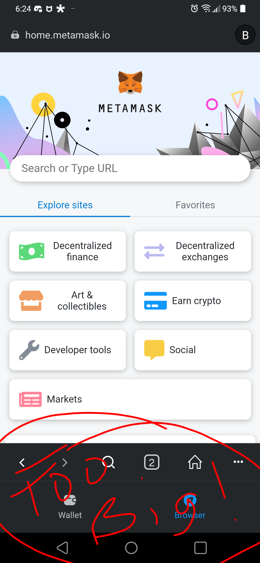
Description: recently MM changed the browser inside the MM app. There is a wallet button and browser button at the bottom of the screen. Those buttons significantly reduce the size of the viewable area. Please change it back or reduce the size of the buttons.
Purpose: increase the viewable area in the browser inside the MM app
Amen to that. Please remove that ridiculous new nav bar. The screen space is one of the most important features of a browser. I dont see any reason for that new nav at all, not to mention the huge size of it. Why should one need to constantly switch between browser and wallet so much, that it should sacrifice 10% of the screen space for it. Make it optional, if there really are someone who wants it.
If the switching between browser and wallet is important for someone, you could easily fit a one button size toggle button to the already existing nav bar. The existing buttons on there dont need that much space. Or put it to the top bar, but please please do not have 3 nav bars on mobile browser!
switch to wallet/browser below
The three are useless to me. Either reduce all three when browsing in page or revert back to previous way (switch to waller/browser from left panel).
This change is a clear ergonomic regression.
Exactly as above. As if using the browser on a mobile phone isn’t painful enough it’s now only the size of half the screen. Please change back! If anything, make the viewable area larger not smaller!
I don’t want to beat a dead horse, but would you please consider fixing the browser UI in the next update? We have a web3 blockchain game launching on multiple networks that can be played from within MM browser, but the UI update has broken the aspect ratio on our game and introduced black bars on the sides. We cannot change the aspect ratio since it causes in-game assets to look strange and also because we want the game to look correct within other dApp browsers such as Trust wallet etc…
As you can see this is not ideal. Thanks for reading. Sorry about the deleted posts but in 2023 apparently you cannot edit your post on this forum that i could see