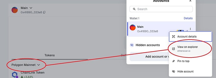
Description: I get that someone probably has to justify their job but Jesus H. The network selector is terrible. Stop it. I get that you guys want us to blend all the networks together but that’s just asking for cross chain sends when the customer doesn’t intend to. It leads to confusion and is bad.
The "View on BSCScan/PolyScan” etc just opening up to ETHScan’s merged chain view (again, trying to blend all the networks together) is absolutely ridiculous. Stop being the way you are. You keep doing these changes that just add multiple clicks for literally no benefit. Want to remove a wallet? Oh that’s 3 more clicks now..
Want to view your wallet on the blockchain? You might as well just go to the blockchain yourself since it’s going to open on ETHScan no matter what.
Purpose: The purpose is to stop being terrible.
Extension/Mobile/Both: Sure.
Images/Attachments:
